Associative Design in Pharmacy Interiors: The Apteka.md Case Study
How can pharmacy interior design influence customer perception? The Apteka.md case study explores how materials, forms and associations communicate technology, transparency and competitive pricing.
Interior design is usually evaluated through two obvious categories: aesthetics and functionality. A space has to work properly, and it has to create a coherent visual impression. But in commercial interior design there is another layer that can be just as important — the emotional and associative perception of a space.
People do not perceive materials, forms, colors and objects independently. We constantly connect what we see with previous experience. Stainless steel may remind us of professional equipment. Glass can suggest transparency, cleanliness and precision. Certain forms, lighting or technical details can make a space feel like a laboratory, a workshop, a hotel or a private residence before we consciously understand why.
This associative mechanism can become a practical design tool. In retail and pharmacy interior design, it is especially valuable because the interior has to do more than accommodate products and customers. It can communicate the positioning of the company, influence how the brand is perceived and support a specific business model.
The renovation concept for the Apteka.md pharmacy chain is a good example of how we used associative design to translate a commercial idea into architecture and interior elements.
The Business Message Behind the Interior
One of the key objectives of the Apteka.md renovation was to communicate a simple idea to customers: this pharmacy chain offers medications at highly competitive prices.
The question for us as designers was how to express this through the interior.
A company can communicate low prices directly through advertising, signage and promotional messages. But interior design allows us to work at another level — through association.
Most customers understand a familiar commercial principle: when a product comes directly from a manufacturer, without a long chain of intermediaries, it is generally expected to be more affordable.
This gave us the starting point for the design concept.
Instead of creating the atmosphere of a conventional retail pharmacy, we wanted to establish an associative connection with the place where pharmaceutical products originate.
In other words, the interior had to suggest:
manufacturer → pharmaceutical production → direct supply → better price
The customer does not necessarily formulate this sequence consciously. That is not the purpose. The task of associative design is to create an environment in which the desired idea feels natural.
From Pharmaceutical Production to Interior Design
Once we had established this direction, the next question was: what does pharmaceutical production look and feel like in people's minds?
The obvious associations are laboratories, production equipment, shelving systems, machinery, conveyor lines and clean technical environments.
These spaces also have a distinctive material language. One of the most recognizable materials is stainless steel.
It is strongly associated with professional environments where hygiene, durability and resistance to intensive use are important. For that reason, stainless steel became one of the principal materials in the Apteka.md interior.
But we did not use it simply because it looks modern. The material had a specific communicative role.
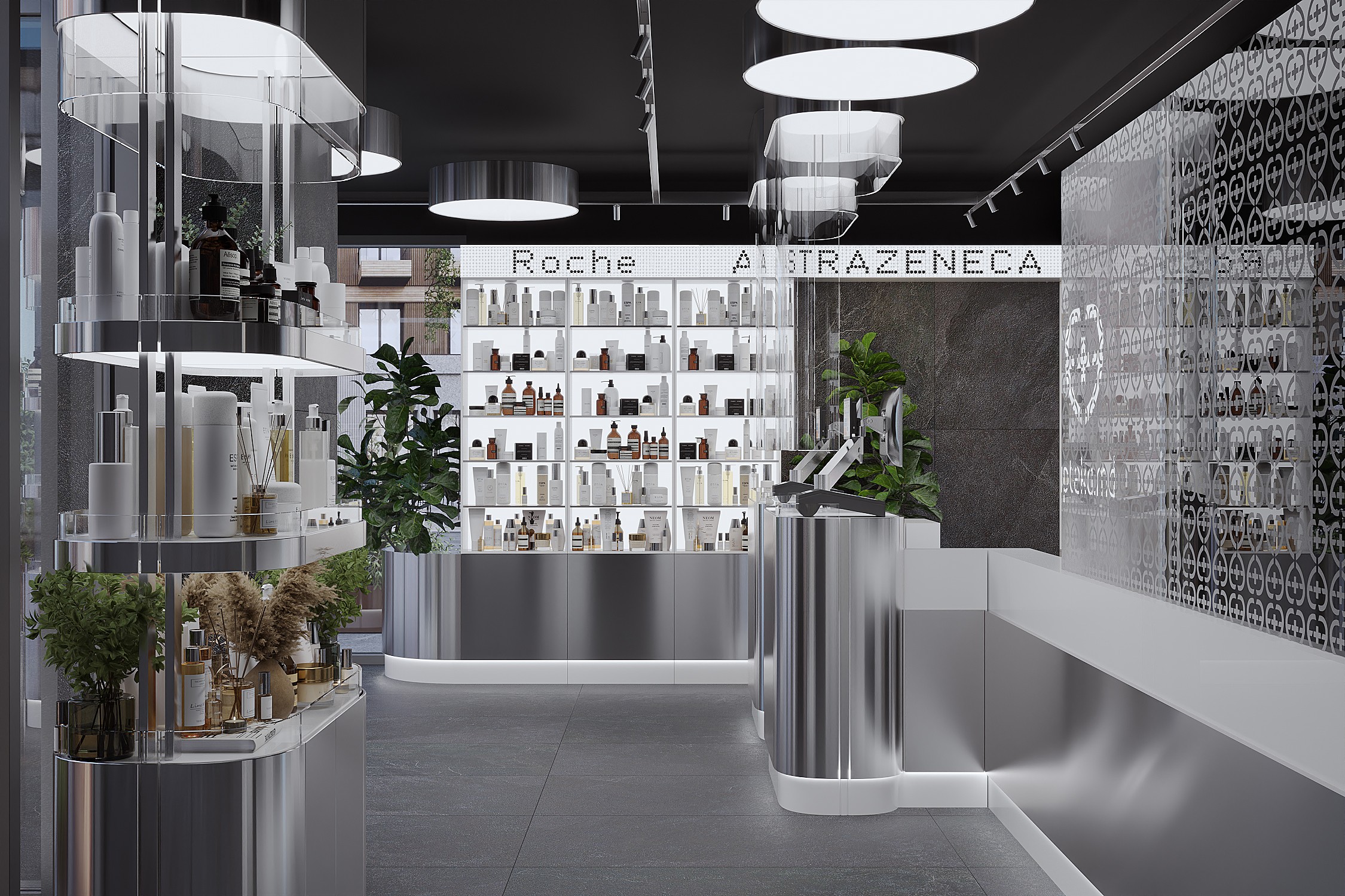
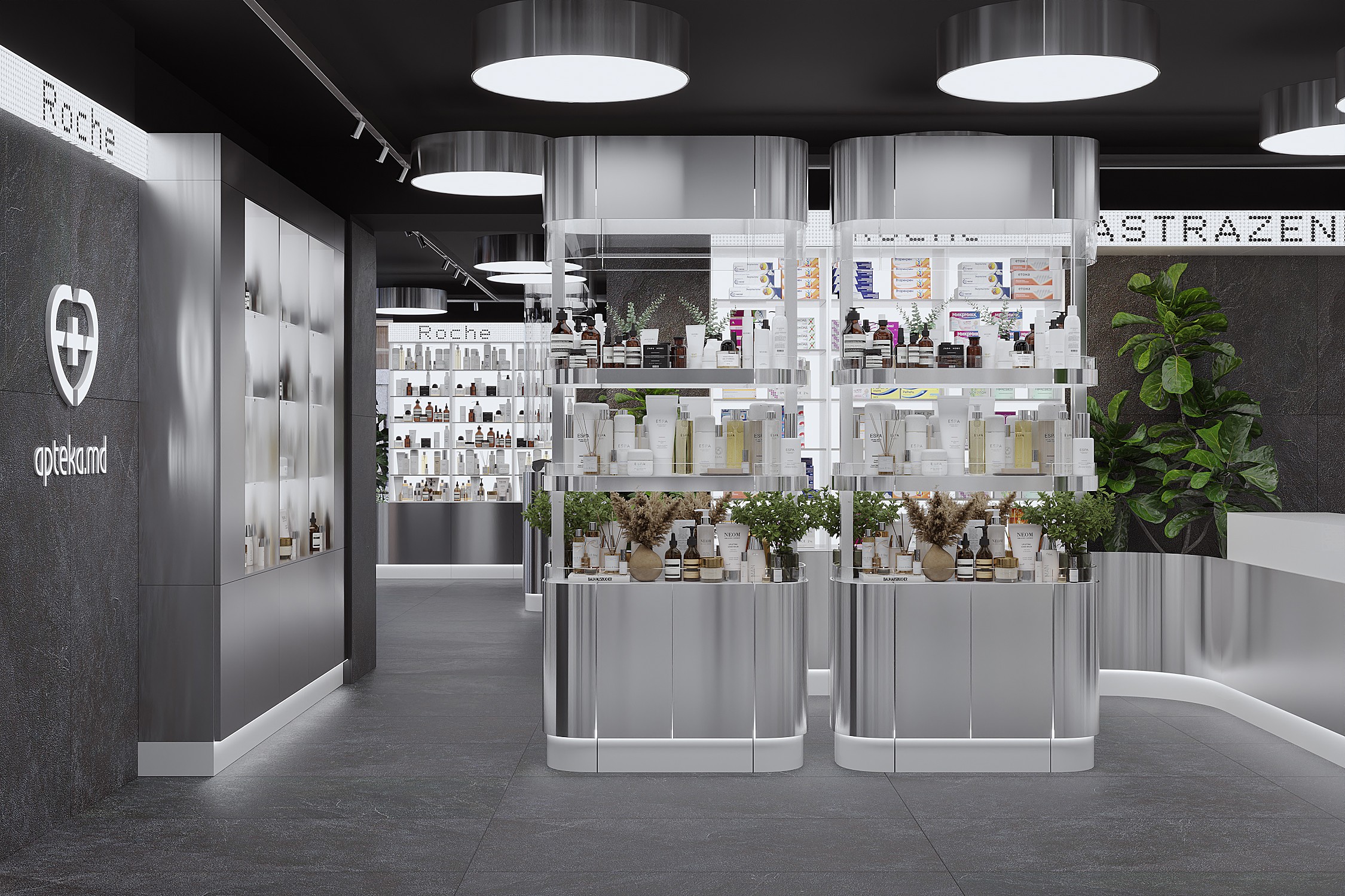
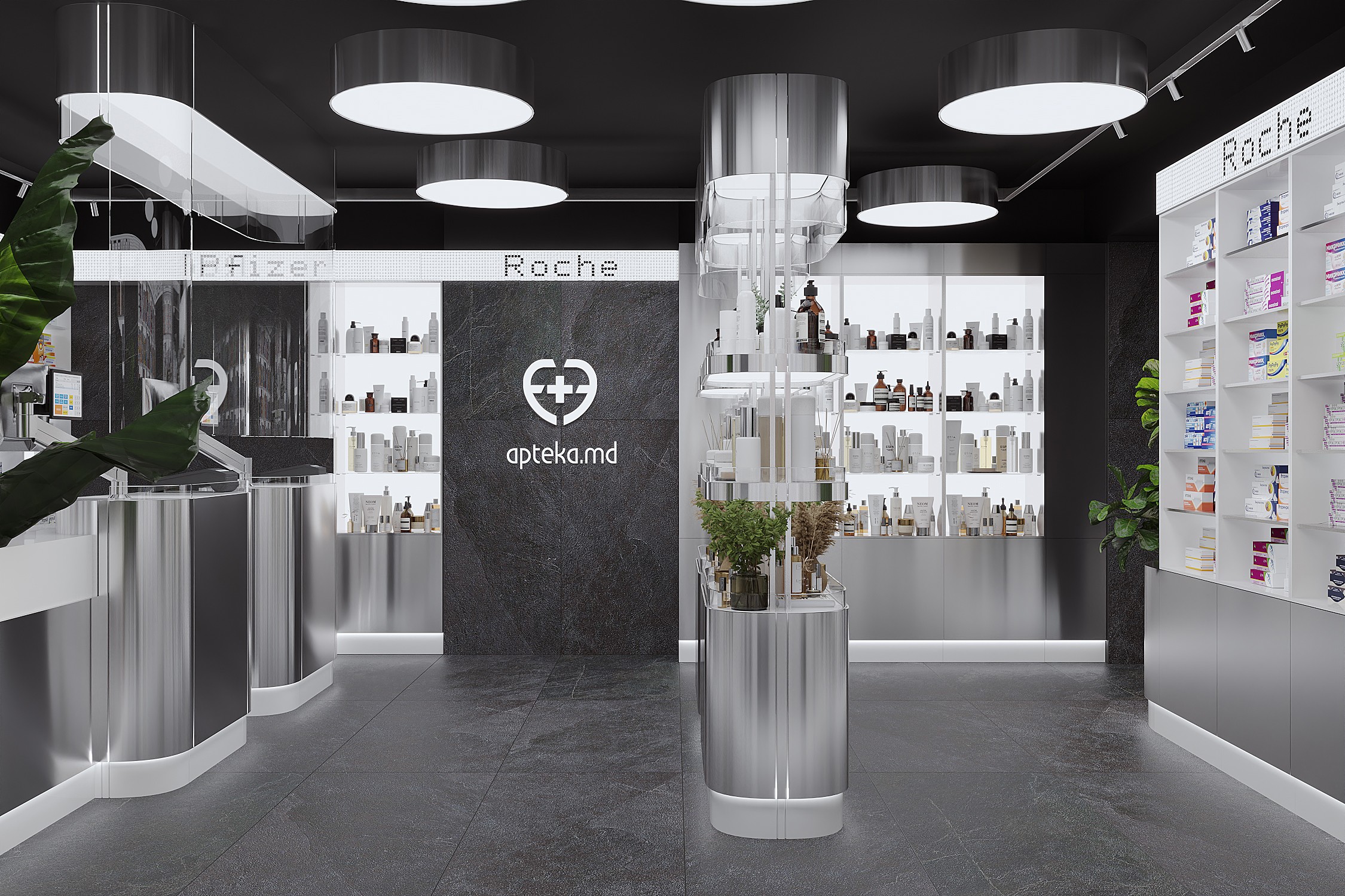
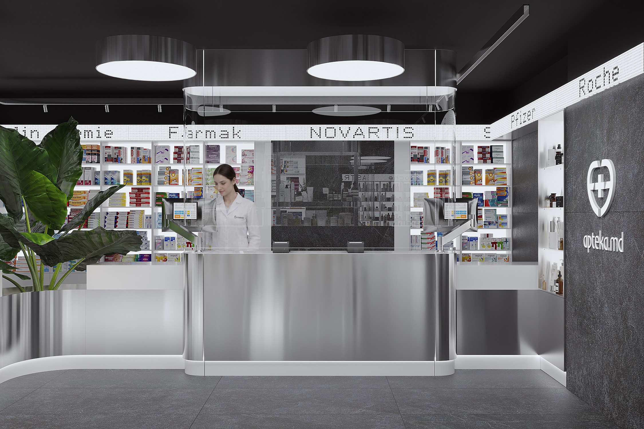
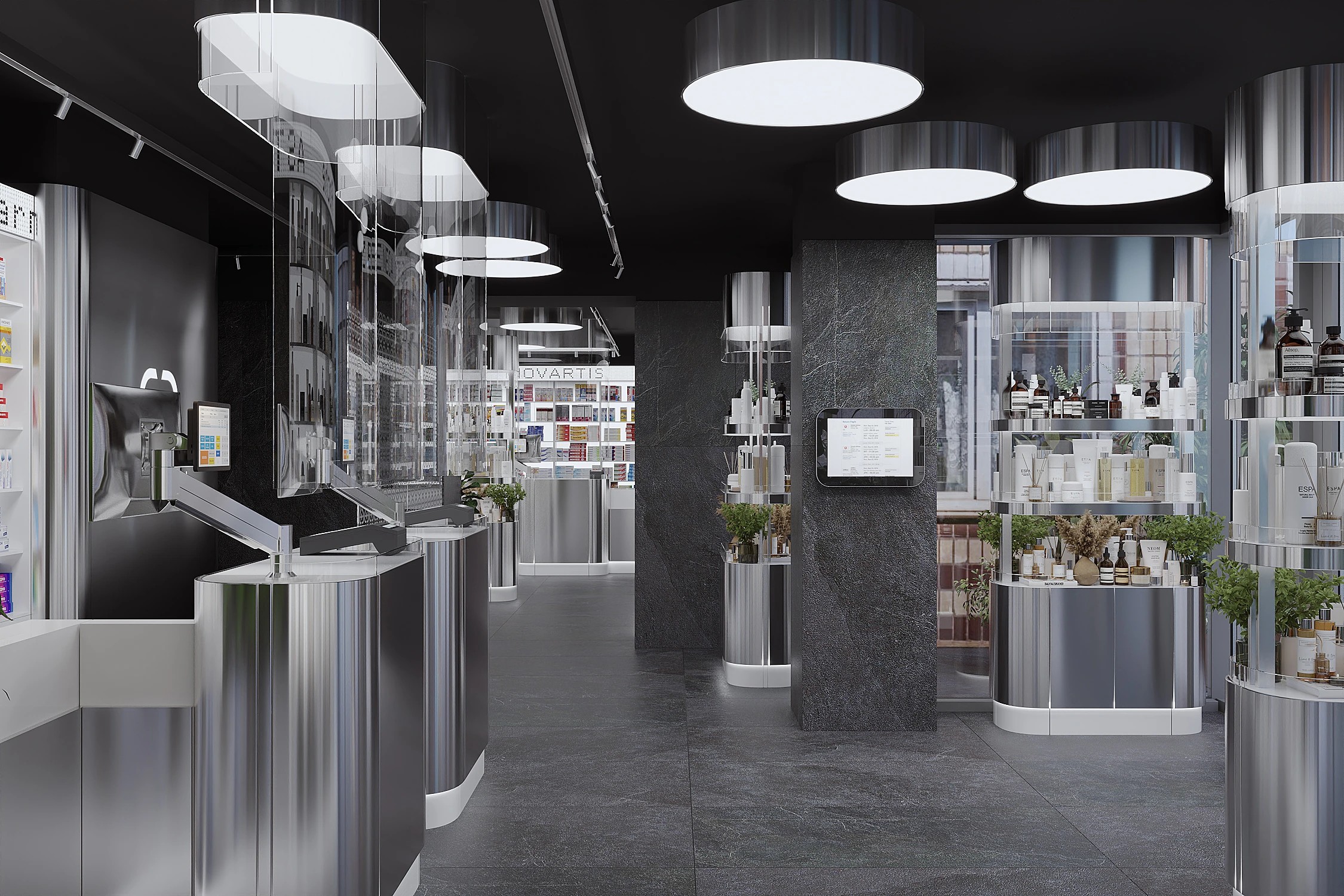
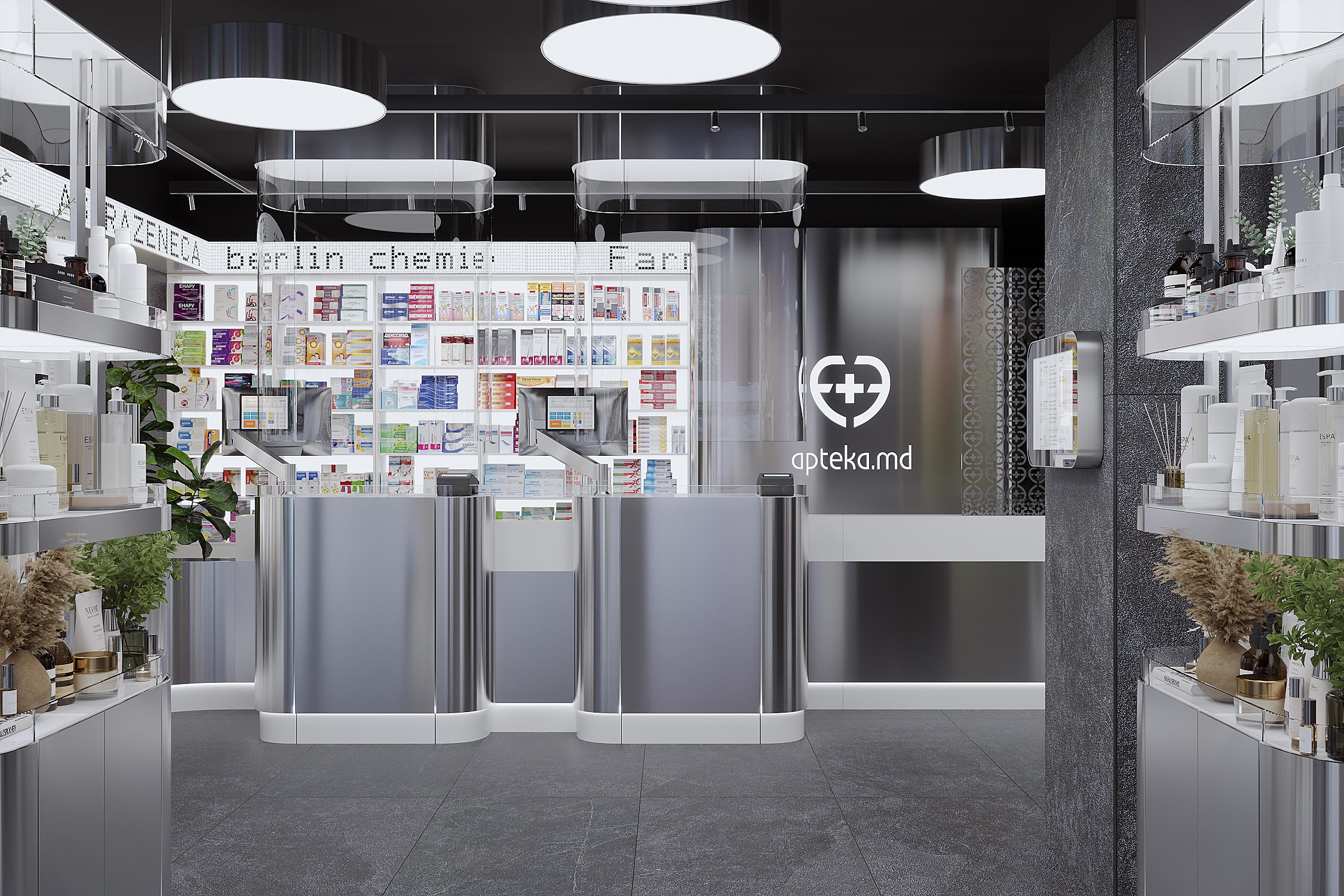
Stainless steel appears on the lower furniture fronts and is also used for the checkout counters. These elements begin to resemble professional equipment rather than conventional retail furniture.
This creates the first layer of the association with pharmaceutical production.
Stainless Steel as a Visual Code
Material selection in commercial interior design should not be reduced to a decorative decision.
A material already carries cultural and functional associations before the designer introduces it into a space.
Wood can suggest warmth and domesticity. Natural stone can communicate permanence and solidity. Polished metal often has a more technical character.
Stainless steel is particularly strongly associated with environments where cleanliness, precision and durability are required — laboratories, professional kitchens, medical facilities and industrial production.
That made it appropriate for the Apteka.md concept.
By introducing stainless steel into elements that customers interact with directly, we could bring the visual language of pharmaceutical production into the retail environment without literally recreating a factory or laboratory.
This distinction is important.
The objective was never to make the pharmacy look like a production facility. The objective was to create enough visual references for the customer to establish the association independently.
Glass: Transparency, Cleanliness and Protection
The second important material in the project is glass.
Its associative function is different from stainless steel.
Glass communicates openness and transparency, but at the same time it can create a physical boundary. It allows us to see what is behind it while clearly separating one zone from another.
This combination made it particularly relevant to the pharmacy interior.
We used glass in checkout areas and in locations where zoning, separation and a sense of cleanliness were necessary.
As a result, glass supports several ideas simultaneously: transparency, protection, precision and sterility.
There is also an interesting contradiction inherent in the material. A glass partition separates people physically but connects spaces visually. For a contemporary pharmacy, this is useful because the environment can remain open without losing the impression of controlled and clearly organized functional zones.
In some checkout areas, the glass elements were curved to follow the geometry of the furniture. This allowed the material concept and the formal language of the interior to work together.
Porcelain Stoneware as a Contrasting Material
The third major material in the project is porcelain stoneware.
We selected a dark surface with a pronounced relief texture reminiscent of fractured natural stone.
Its purpose was partly to provide contrast.
Stainless steel and glass have precise, technical characteristics. The darker, textured porcelain stoneware gives the interior visual weight and creates a background against which the metallic and transparent elements become more expressive.
The interaction between these three materials became fundamental to the identity of the pharmacy:
stainless steel — technology and production
glass — transparency, cleanliness and protection
dark textured porcelain stoneware — solidity, contrast and material depth
Together, they create an interior that does not resemble a traditional pharmacy.
Instead, the space exists somewhere between a contemporary retail environment, a laboratory and a pharmaceutical production facility.
And this is precisely where the associative concept begins to work.
The Interior Does Not Have to Explain Everything Literally
One of the mistakes that can occur in commercial design is attempting to communicate every idea literally.
If the concept is technology, designers add screens. If the concept is nature, they add plants. If the concept is affordability, they add large signs about discounts.
Associative design works differently.
The customer does not need to enter Apteka.md and consciously think: stainless steel means pharmaceutical production, pharmaceutical production means direct supply, and direct supply means lower prices.
That would be too literal.
Instead, the materials, details and spatial atmosphere establish a background perception.
The pharmacy feels technological. It feels connected to the pharmaceutical industry rather than conventional retail. The environment creates an impression of a place closely associated with the production and distribution of medication.
Advertising and informational communication can then deliver the direct commercial message.
Interior design prepares the emotional context in which that message is perceived.
From a Traditional Pharmacy to an Online Order Point
The project had another important business objective.
Apteka.md wanted to communicate that ordering medications online could be more advantageous than visiting a pharmacy solely to make a conventional purchase.
This changes the role of the physical store.
Traditionally, a pharmacy is a place where a customer arrives, searches for or requests a product, makes a decision and completes the purchase.
With the development of online ordering, part of this process moves outside the physical space.
The pharmacy increasingly becomes an interface between the digital service and the customer — a place for consultation, communication and collection of previously placed online orders.
That transition also needed to become visible in the interior.
Designing for a Digital Retail Model
We addressed this part of the concept through informational displays, promotional materials and integrated communication elements.
Their purpose was not merely advertising. They had to explain a different way of interacting with the pharmacy: customers could order products online and then use the physical location as part of that digital purchasing process.
At the same time, the architectural language needed to support the idea of a contemporary service.
For this reason, many furniture elements were intentionally designed with rounded transitions and radius corners rather than rigid conventional retail geometry.
The curved forms give the interior a more contemporary and slightly futuristic character.
Even the glass constructions around the checkout areas follow the geometry of the furniture. Instead of treating partitions, counters and informational elements as separate objects, we tried to create a continuous visual system.
This formal language reinforces the idea that the pharmacy represents a changing retail model rather than a traditional shop with shelves and a checkout counter.
Why Associative Design Matters in Commercial Interiors
The Apteka.md project demonstrates a broader principle that we use in commercial interior design.
A successful commercial interior should not only answer the question: What should this space look like?
It should also answer: What should a person understand and feel when entering this space?
Those are different questions.
A visually attractive pharmacy can still say nothing about the business behind it. A functional retail space can efficiently organize customer flows while failing to establish any distinctive brand perception.
Associative design creates a connection between business strategy and physical environment.
The process can be described as:
Business objective → desired customer perception → associations → materials and forms → spatial experience.
In the Apteka.md project, the business objective was not simply to create a modern pharmacy interior.
The company wanted customers to perceive the brand as technologically advanced, closely connected to pharmaceutical production and capable of offering favorable prices. At the same time, it wanted to encourage a transition toward online ordering.
Those objectives determined the associations. The associations determined the material palette and formal language. Only after that did they become specific interior design decisions.
Material Is Part of the Brand Message
This is why I do not consider material selection to be purely an aesthetic stage of interior design.
In a commercial project, materials can become part of brand communication.
The same applies to geometry.
Rounded furniture in this project is not simply a stylistic preference. Stainless steel is not present simply because metallic surfaces look contemporary. Glass is not used only because transparency makes a space appear larger.
Each decision belongs to the same system.
When these elements reinforce one another, customers may not consciously identify every reference, but they perceive a coherent atmosphere.
And that atmosphere becomes part of their perception of the company.
Can Interior Design Influence How Customers Perceive Price?
Not directly.
Interior design cannot replace pricing strategy, advertising or the actual commercial offer. But it can create the context in which that offer is understood.
This distinction is essential.
In the Apteka.md concept, we did not attempt to communicate “cheap pharmacy” through inexpensive-looking materials or aggressive discount aesthetics. That approach could easily reduce trust — particularly in a field connected with health and pharmaceutical products.
Instead, we approached affordability through the idea of proximity to production.
The desired association was not:
cheap → low quality
but rather:
direct, efficient, technological supply → better price
That allowed us to communicate affordability while maintaining an image of professionalism, cleanliness and technological precision.
Design as a System of Associations
People rarely experience interiors as a collection of isolated design decisions. They experience the whole.
A customer probably will not analyze why a counter is made of stainless steel, why a glass partition is curved or why the floor has a dark mineral texture.
But together, these decisions create an impression.
This is where associative thinking becomes valuable for architects and interior designers.
Instead of beginning with a question such as “Which material would look good here?”, we can begin one step earlier:
What should this material communicate?
Instead of asking only “Which form is more attractive?”, we can ask:
What does this form remind the customer of, and does that association support the business concept?
For me, this is one of the important differences between decoration and strategic commercial interior design.
The goal is not simply to compose attractive objects.
The goal is to construct a visual and spatial language in which materials, forms, lighting, graphics and functional organization all contribute to the same idea.
Apteka.md: Interior Design as Business Communication
The renovation of Apteka.md therefore became more than a visual update of a pharmacy chain.
The interior was designed around two changes in customer perception.
First, we wanted to establish an association between the pharmacy and pharmaceutical production, supporting the idea of direct supply and competitive pricing.
Second, we wanted the environment to communicate the transition from the conventional pharmacy model toward online ordering and physical order collection.
Stainless steel, glass and dark textured porcelain stoneware created the material foundation of the first idea.
Information systems, rounded furniture, curved glass and a more futuristic spatial language supported the second.
None of these elements works independently. Their value comes from the relationship between them.
That is ultimately how associative design works: not by telling the customer what to think, but by creating a sequence of visual references that makes a particular perception of the brand more likely.
For commercial interior design, this can be much more powerful than aesthetics alone.
Frequently Asked Questions
What is associative design in interior design?
Associative design uses materials, forms, colors and spatial elements to trigger familiar associations that support a particular perception of a space or brand. In commercial interiors, these associations can communicate ideas such as technology, transparency, exclusivity, affordability or craftsmanship without expressing them literally.
How can interior design influence the perception of a pharmacy brand?
A pharmacy interior can influence brand perception through material selection, spatial organization, lighting, furniture, graphics and other visual cues. Together, these elements can reinforce qualities such as cleanliness, technological sophistication, transparency and trust.
Why was stainless steel used in the Apteka.md interior?
Stainless steel was selected because of its strong association with pharmaceutical production, laboratories and professional equipment. In the Apteka.md concept, it helps establish a visual connection between the retail pharmacy and the environment in which pharmaceutical products are produced.
Why is glass suitable for pharmacy interior design?
Glass combines visual openness with physical separation. It can communicate transparency and cleanliness while providing functional zoning and protection in checkout and service areas.
How can pharmacy design support online ordering?
A physical pharmacy can support an online-first retail model through clear information systems, customer interaction and collection areas, digital communication elements and an interior identity that communicates a contemporary, technology-oriented service.